Branding
When I started at Ripple Street, they hadn’t had a brand refresh in many years. In fact, no one could seem to remember how long it had been. Needless to say, they needed a complete overhaul. The old branding felt very dated and lacked the fun, lighthearted spirit of what Ripple Street truly was. I started with a tune-up of the logo.
Ripple Street
OLD Ripple Street logos:
NEW Ripple Street logos:
In addition to the colors, note other improvements such as the spacing between the letters and the improved “speech bubble dot” of the “i” in the large version.
The old icon version was frankly just silly. You don’t just pop your full logo into a shape and call it an icon. I fixed that issue and added the orange “ripple” to the edge.
Let’s talk color palettes for a minute. I found the old palette to be rather dour and what I want to describe as “dusty” looking. The colors themeselves looked like they needed to be wiped down with a rag. I wanted bold, saturated colors, and took my inspiration from a sunrise/sunset.
OLD Ripple Street Palette:
NEW Ripple Street Palette:
I mean, come on! Ripple Street is about creating fun, unique experiences with new products and brands. You need a lively, exciting palette.
The old palette isn’t terrible, but it’s not right for THIS company. Maybe for an asset investment firm?
Another major change I wanted to dive into right away was photography. The agency had peppered everything with my old nemesis—stock photography! This was particularly confounding to me since Ripple Street has a ton of great UGC from their community. Seems like a no-brainer to me. You can actually see one of the stock photos they used in the lower left corner of photos in the slides below. On that note…
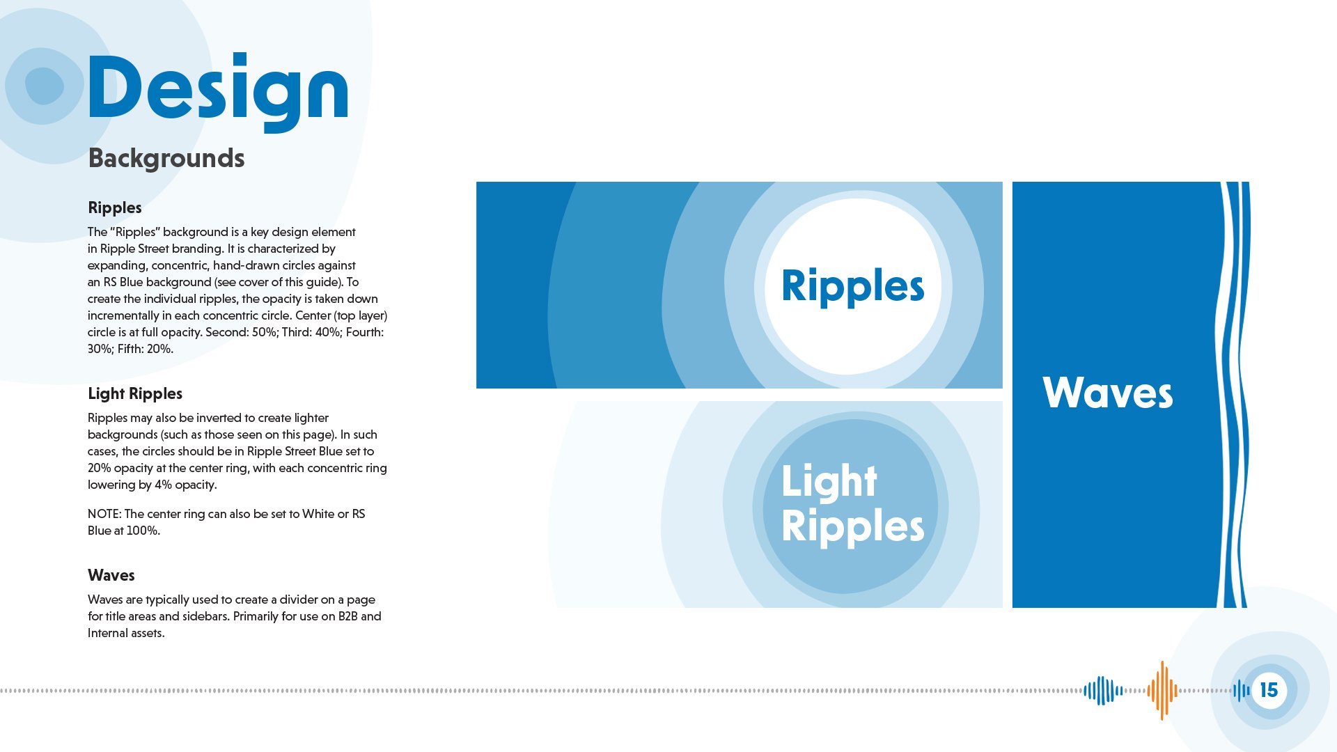
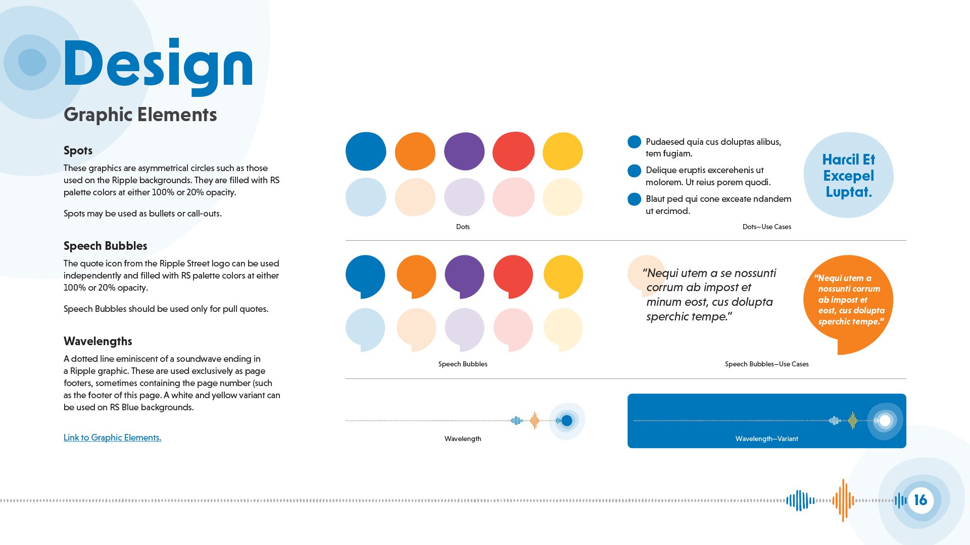
Check out the Brand Style Guide I created below to see how it all came together!
Health Media Network has since been bought out and what you’re seeing below no longer exists (except via the Wayback machine if you’re feeling curious). Nevertheless, this was a big project I undertook during the pandemic. Their old branding was… not great. My goal was to give them a nice, clean refresh. The old site (swipe on the image to have a look) was blocky chaos. I gave them a much friendlier and inviting look.
Health Media Network
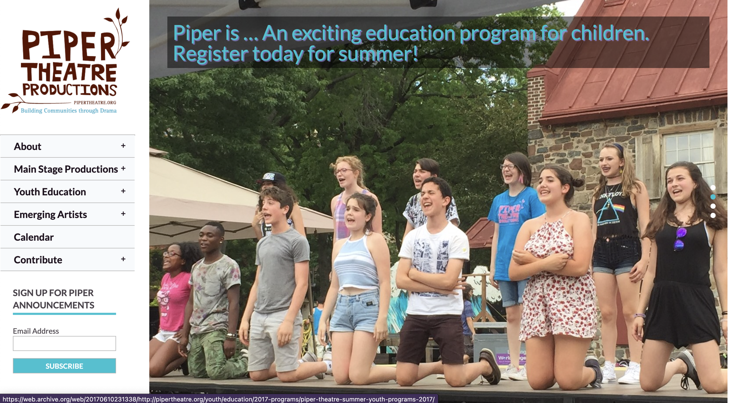
Piper Theatre really only had one problem with branding—they didn’t have any. Well, that’s not totally true, they had a logo. Otherwise it was basically this:
Piper Theatre
Yep. It’s a group of slightly bored children serving as the “hero” image. So, yeah, I had a pretty clean slate to work with. After adding some basics such as color palettes and fonts, I got to work adding some personality to their assets, which included programs, banners, posters, and a nifty little brouchure…

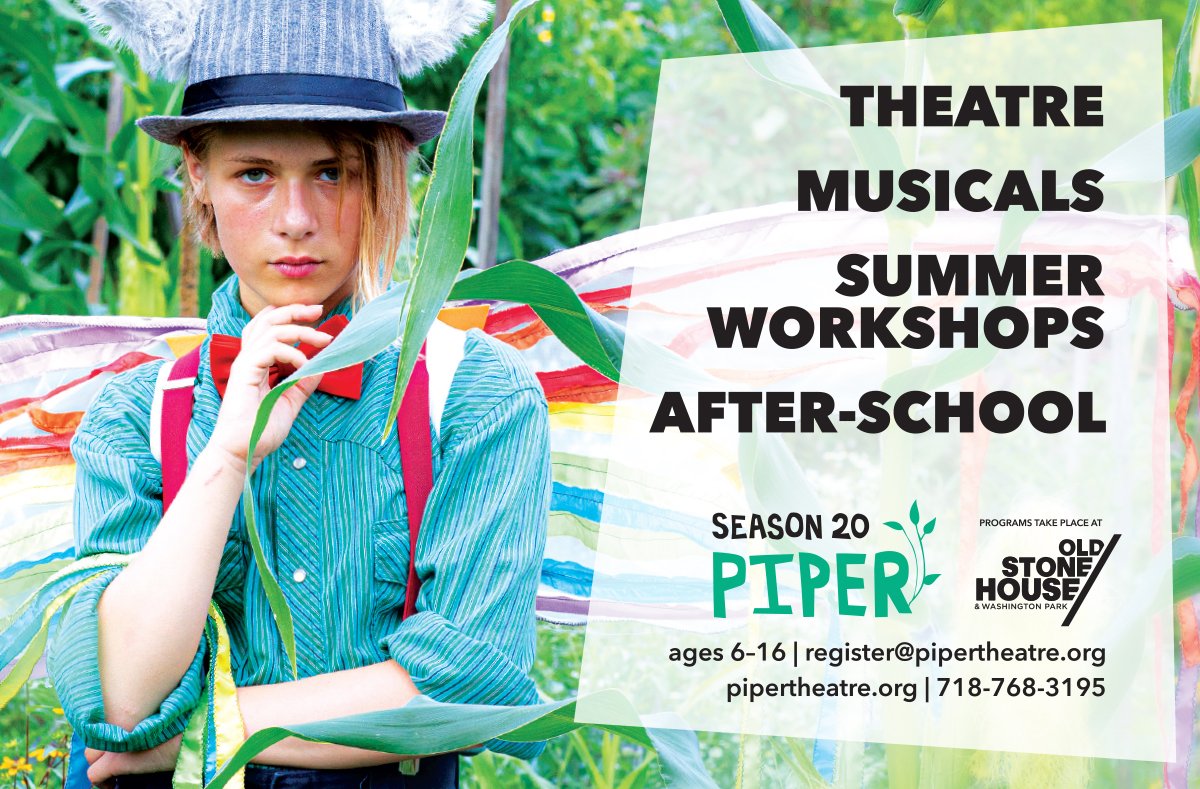
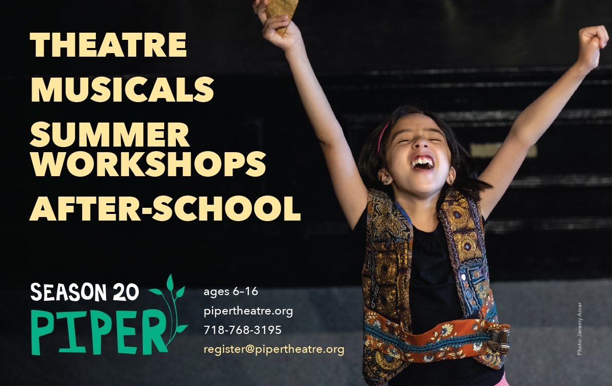
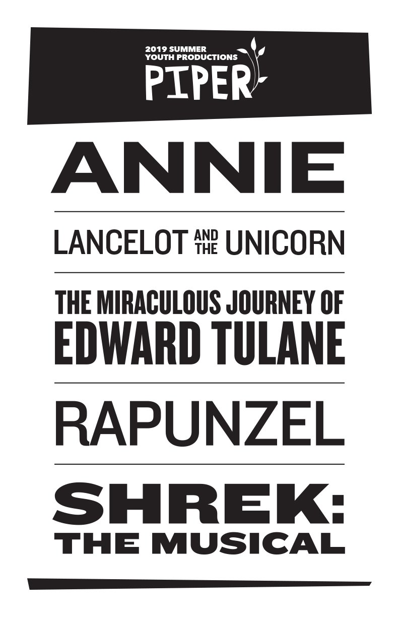

The following year, I came back to help out with the 2019 season, which you might recall as being…(ahem)…an ill-advised time to do large-scale social activities. Piper pivoted to Zoom performances with an updated logo. I decided to go ahead and embrace the Zoom aesthetic…


