Since early 2020, I’ve had the opportunity to work on various projects with StoryCorps. They’ve been good enough to give me some wiggle room within their style guide and assets, allowing me to add my own sense of playful engagement to the end product.
Below are select pages from the 2019 Annual Report, followed by the “All Our Voices” toolkit.
Scroll left and right through the galleries below Have at it!
StoryCorps

The cover was based on a photo from their archives. I wanted to keep the theme of two people having an intimate/enlightening conversation while incorporating an "illustrative road map" theme.
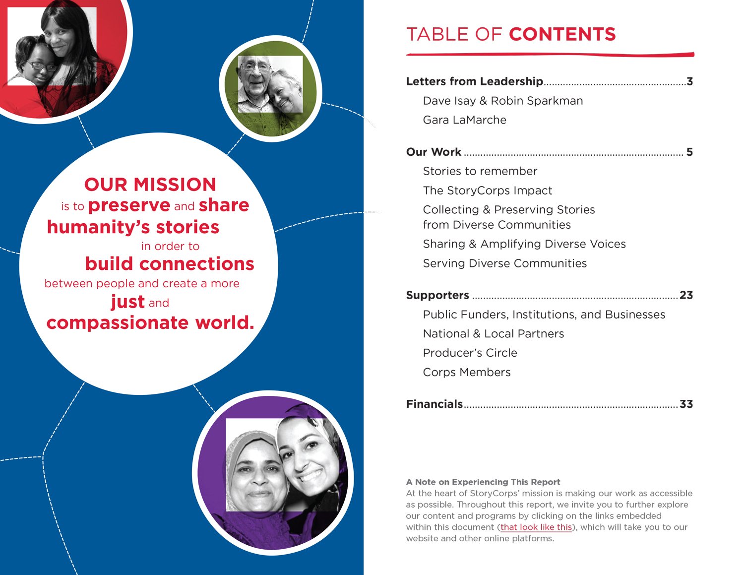
I wanted to convey the connections between people as reminiscent of roads connecting cities (road tours were a big part of StoryCorps in 2019). This also gave it an almost "molecular" feel, emphasizing the connection theme.

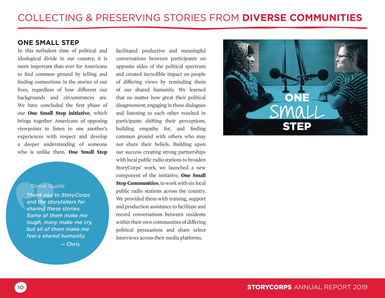
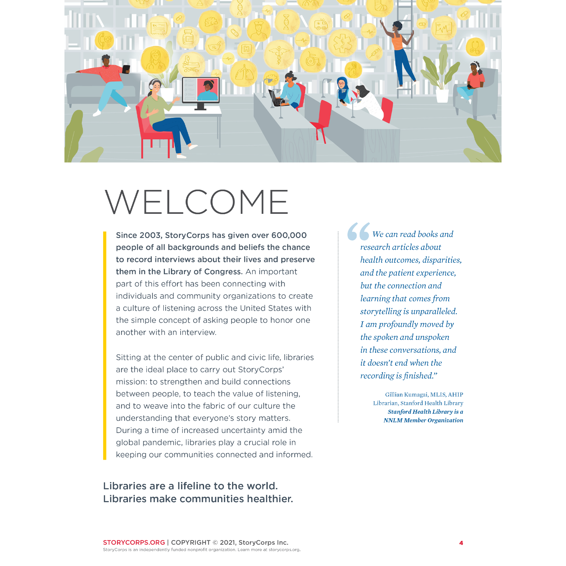
I love opportunities to do a bit of illustration (clearly). For this project, I did a series of 2-color illustrations based on StoryCorps photos and peppered them throughout the report.

Another 2-color illustration, this time worked into an infographic. I made the icons for the infographic as well.
Although this report had a sense of playfulness, keeping it clean and professional was also important. I believe merging those two elements is a strength of mine as a designer.
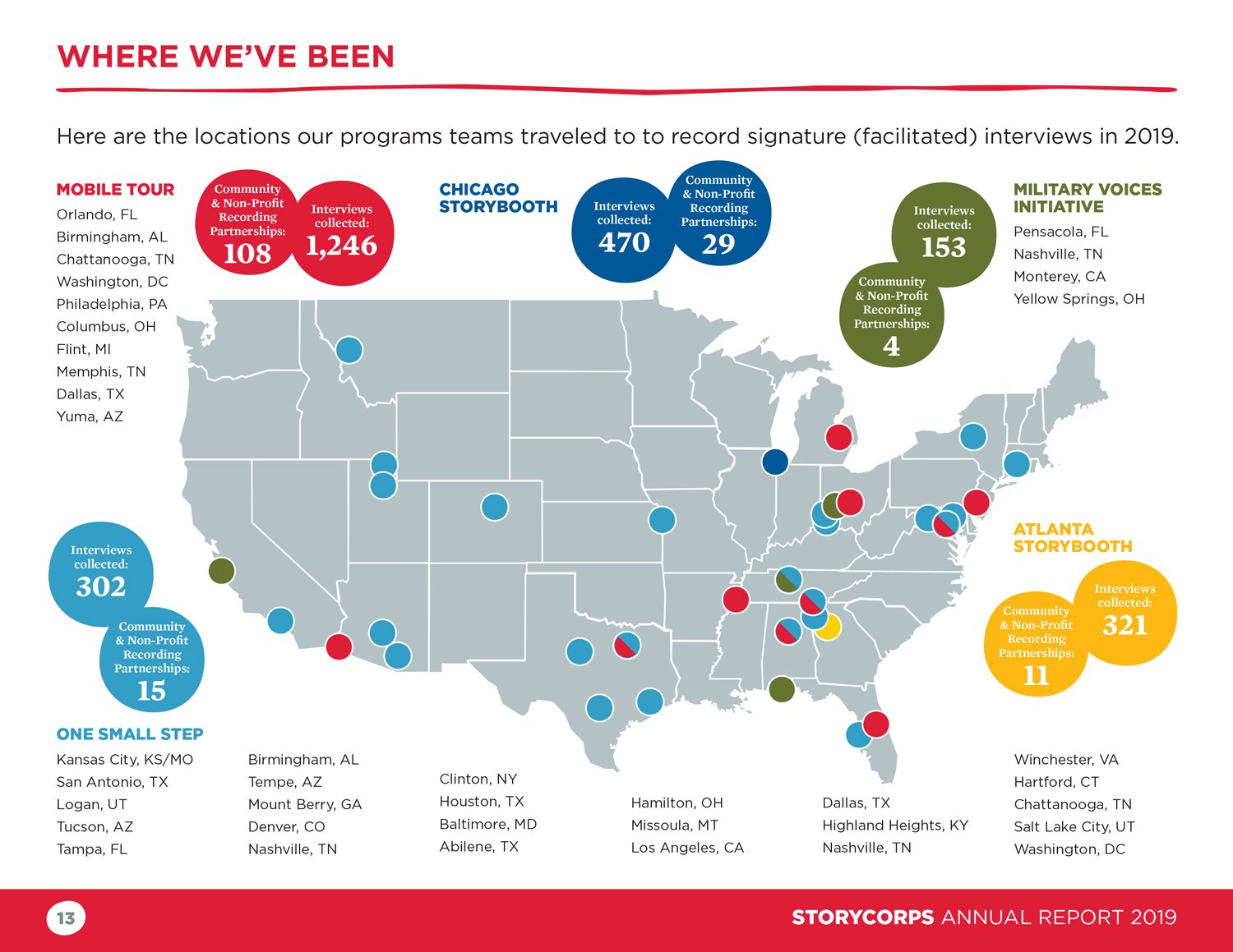
On the wish list for one of the people at StoryCorps was a map detailing where they had gone for “signature interviews”. She didn’t know if it would be feasible in the time we had, which I took as a personal challenge. She was GETTING that map!

Section header pages allowed me to merge StoryCorps photography with my “roadmap” theme.

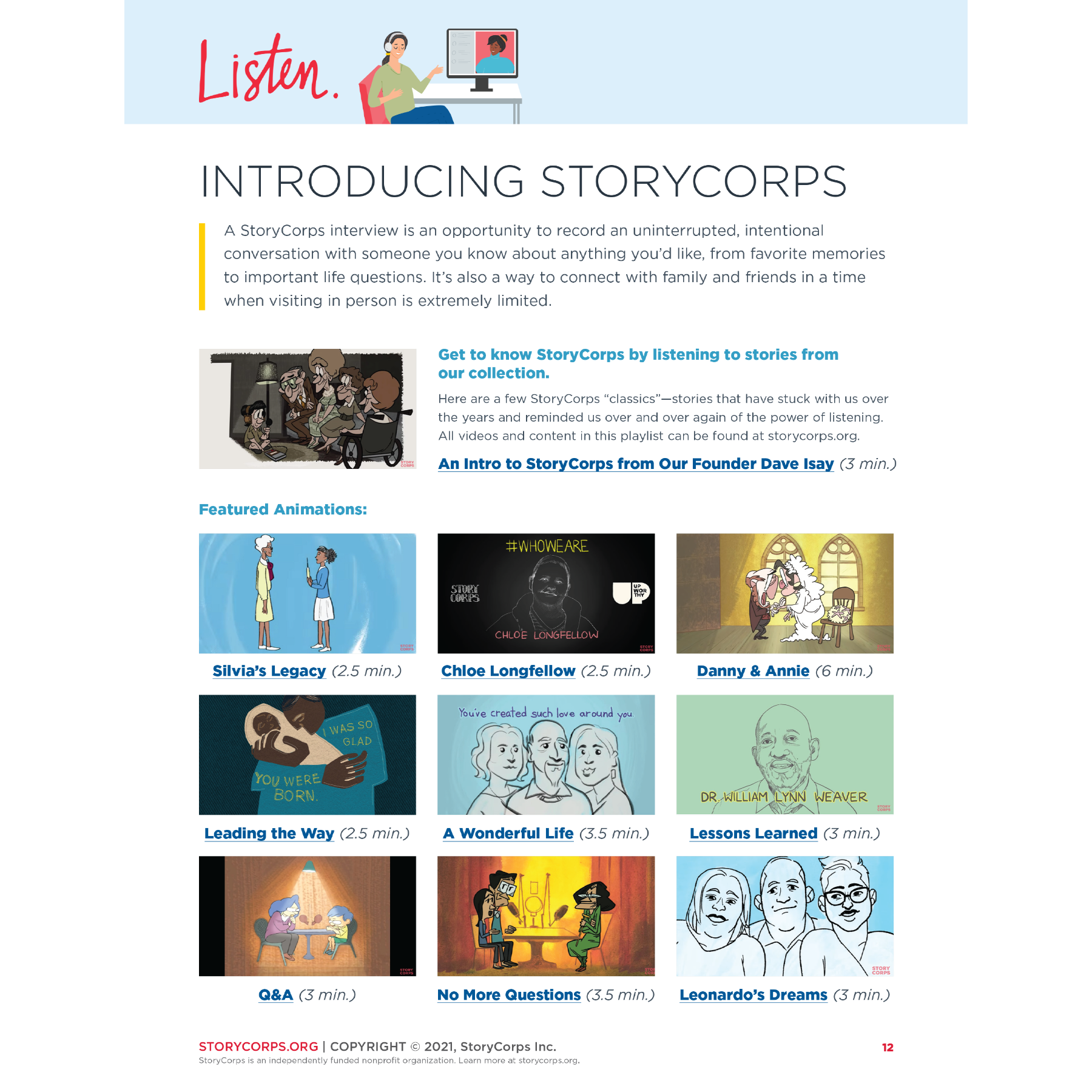
The challenge here was to make the stats and interactive clip links part of a cohesive whole that didn’t look like just a random block of text. I opted to make a mini infographic out of it.

Some page layouts feel like complicated puzzles at first—much like this one. Making each of the elements come together with a flow that ultimately makes it look easy made this boy proud.
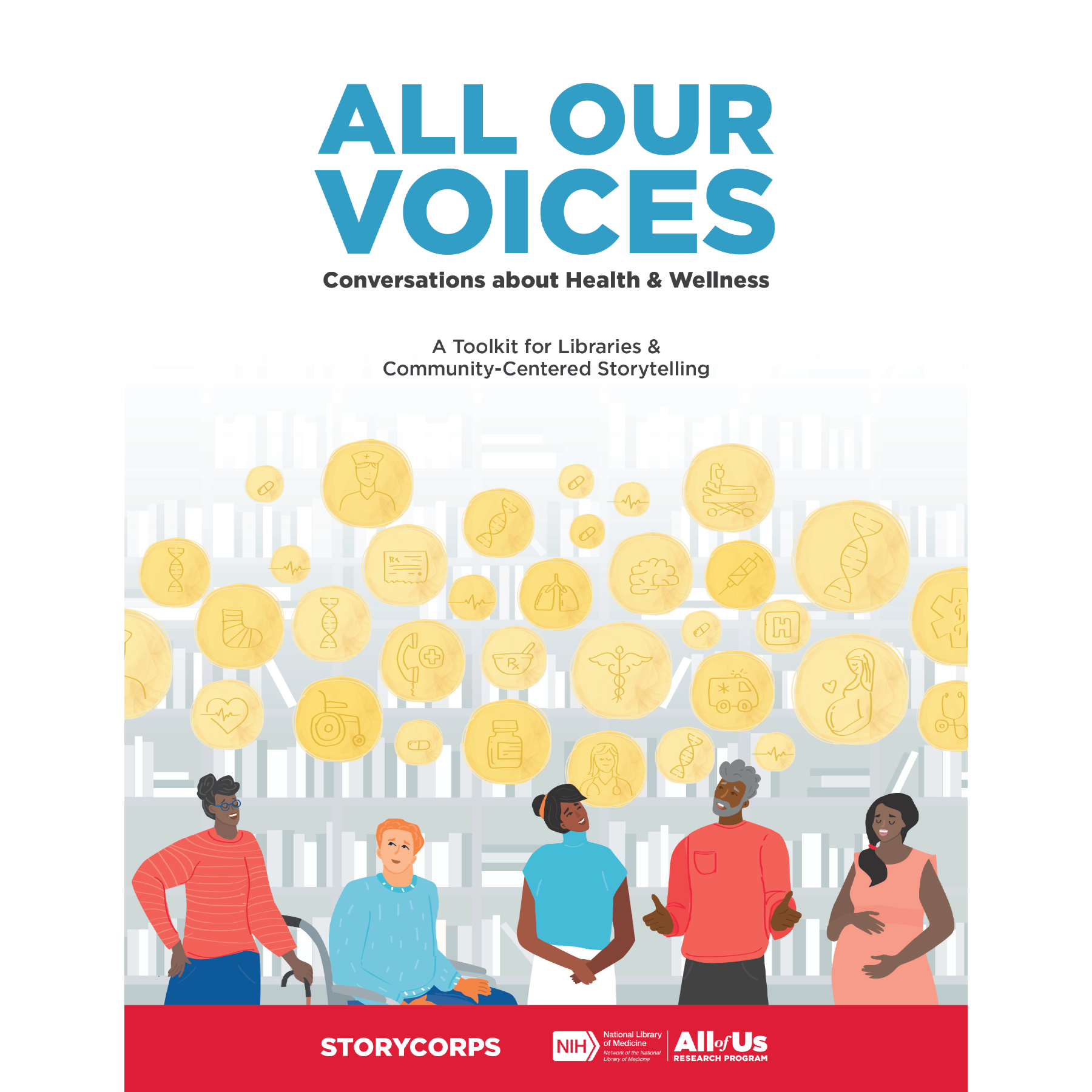
Original art from the fantastic illustrator Megan Jett was the launchpad for this booklet. Using the strengths of provided assets always makes the job easier.

I utilized the “dots” from the illustrations to create the Venn Diagram above—love the way it came out.

A section heading page. I repurposed elements from the illustration on these pages and used them to provide a visual through-line to the pages that followed.
The banner strip at the top of the page echoes the header page (previous slide).

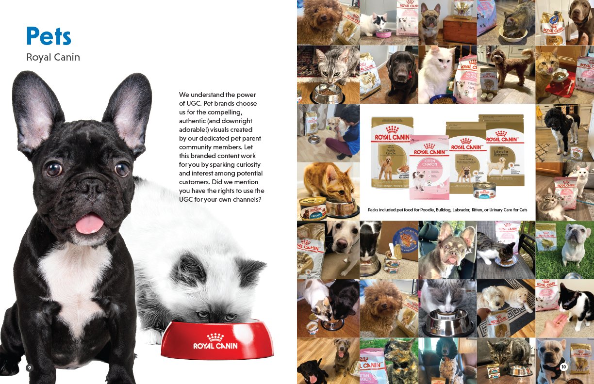
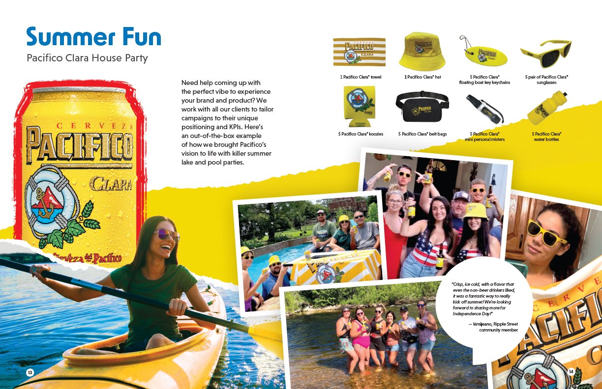
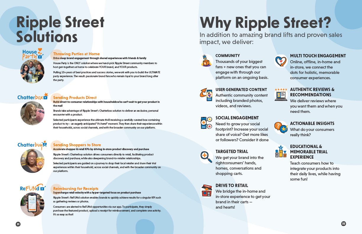
At Ripple Street, we decided to create a piece of collateral to showcase our campaigns, and the Campaign Catalog was born! Having a background in magazines (see below), I decided to make it less “catalog-y” and more a series of narrative-beauty-spreads to get potential clients excited about what we bring to the table. Using a mixture of Ripple Street branding, client branding, and UGC I created the Ripple Street Campaign Catalog…
Campaign Catalog


During my tenure at Scholastic, I worked in several different departments that kept eating each other like a giant children's publishing Ouroboros serpent. Several recurring tasks, however, would roll from one department to the next, such as the custom mini-magazines below. I ended up being the go-to guy for these.
Magazines

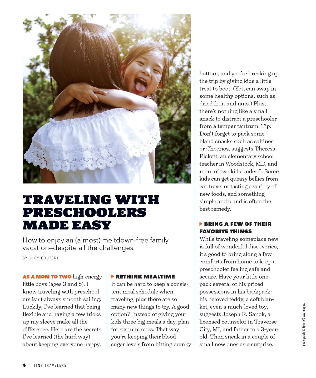
We did Tiny Travelers for a few years. Yes, they did promote Disney Theme Parks, but also offered genuine travel content by Scholastic writers.

This ad was intended to drive traffic to the online content. It also allowed me to showcase some more of my illustrations.

This page features content provided by Scholastic for the magazine. Stock photography isn't ALWAYS bad I suppose—this is pretty cute.


In previous years, Disney supplied the ad for the back page. On this occasion, however, they left it to me. I was given access to some of their photography and to “The Power of Magic” logo, and told to go for it. Here is the end result!

A science-themed mini magazine for kids and parents sponsored by... (clears throat and glances around nervously) Lockheed Martin. I particularly love this energetic and inspirational cover.
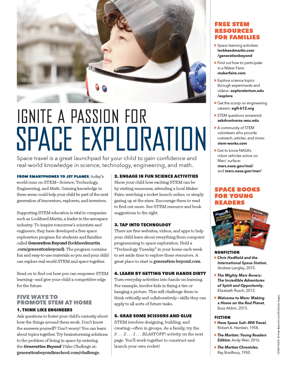
This and the following page were the inside spread. That's right—this mini-mag was four pages long, only 2 of which were content! A lot to get through...

Page 2 of the spread! Got to add a little illustration up in the top right.

I sculpted each of the Play-Doh assets on this page (and many others throughout the program). I also wanted to use “splotches” of primary colors here and there (the ground in this case) that would have a clay-like feel.

More clay assets by me here. You can see larger versions of them in my "Illustration" section.

LITTLE kid stuff! Fire Truck!

Shapes! Everywhere!
Ads
I had several ads featured in Scholastic Parent & Child magazine as well as the mini-magazines I worked on (see above). Here’s a few of my favorites.

This was the centerpiece of the "Tiny Travelers" mini magazine from the above section. Crazy complicated to plan (it was entirely thought out by me and the project manager), but it paid off!

A fun snack-themed flowchart. After helping to develop the initial concept, I designed and wrote copy for this final ad.
I liked the photo they provided, but I was initially unsure of how to execute the ad. What I came up with has remained one of my favorite ads—it’s simple, yet there’s energy and flow to it.